

 SIR Art Journal
Before
the Name:
Blue
For most of my life I found blue boring.
In this artist’s essay, Kohlben Vodden follows blue through perception, language and material, asking what a colour does before we decide what it means.
Read the essay →The Eye
Blue resists a single, fixed view. Vodden considers how the eye, light and movement shape our encounter with the colour and with his reflective works.
Continue reading →Introduction
For most of my life I found blue boring. It wasn’t that I genuinely disliked it. I just didn’t respect it. Why? The way it was presented to me in my childhood. From very early on blue was presented to me with ready-made meaning. I was told blue is for boys, blue is calming and blue conveys trust. By the time, I was experiencing the colour – it seemed that society had already thoroughly agreed upon its meaning. Which meant I had nothing to explore or experiment with. As an adult, I used it in paintings because it worked in a palette and because it was preloaded with meaning that I hadn’t chosen, but wanted to convey.
It wasn’t until I was asked to take on blue as a subject for an exhibition, that I took the time to sit with Blue as a concept and not just a colour. I began my research, expecting to confirm what I already knew. What I found was a colour with an intriguing history and psychology that was unrecognisable to the one I had been handed as a child.
This discovery that blue wasn’t what I’d been led to believe was serendipitous and almost spiritual as it came only a few months after I had a similar experience learning about a long term relationship. That the account I had been given of it, and the person in it, had been false throughout. I had invested 17 years in a fictional version of events made for me rather than with me. I had been living inside a description someone else had authored. So had blue. Until my hand was forced to peek behind the curtain, I had accepted both at face value. That is why blue became interesting and personal and why it’s the first colour that I have written about.
My philosophy as an artist is that colour speaks before the mind can name it. That the body answers first, below conscious awareness, and the words, when they come, are always a step behind.
There are people who cannot see, yet they still respond to blue. One of them was an eighty-seven year old woman, blind for years, with no functioning rods or cones. In an experiment, a light was turned on and she reported nothing at all. Then the wavelength was changed to blue and her pupils closed. When asked, she correctly identified an event that she couldn’t see.
The response runs even deeper than the pupil reacting. Blue light suppresses melatonin, shifts the body clock, and raises alertness in people, even in one who cannot see it at all. Both findings were published in Current Biology in 2007 by a team that included Harvard and Oxford universities. Blue gets through when nothing else does because it was never about seeing. Our bodies are hard wired through evolution to know that short wavelengths fill the sky at twilight, and that is part of what tells the body where it is in the day. It works in the body before the mind could name it.
This is what blue is for me and it is the argument of everything that follows. Blue is proof that consciousness is not where experience begins, it is where experience becomes observed.
Blue really is the colour where the distance between the response and the account is widest. As I will explain, it is the last primary colour language reaches, the hardest to hold as material, and optically the colour of things too far away to touch. Blue does not just illustrate this gap. It is made of it.
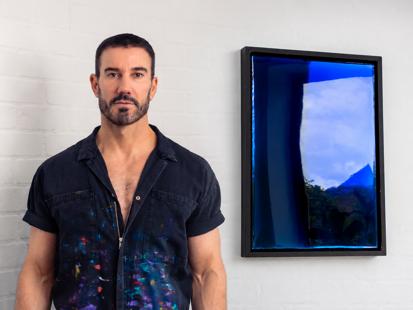
Artist: Kohlben Vodden · Photograph: Olly Graham
The Eye
When you look directly at something blue, you are looking at it with the wrong part of your eye. The cells that detect blue are scattered thinly across the retina and missing entirely from its centre. This means the sharpest part of your vision is the part least equipped to find blue. Physics also works against you here. The eye bends short wavelengths so sharply that blue light fails to reach the back of your eye in sharp focus. This means that every blue you have ever seen has been distorted. Thoreau, in his journals, got there first when he said Blue is light seen through a veil.
This is not a weakness in blue. It is where its depth comes from. You cannot take blue in at a glance, you have to keep working at it, and that gives it value.
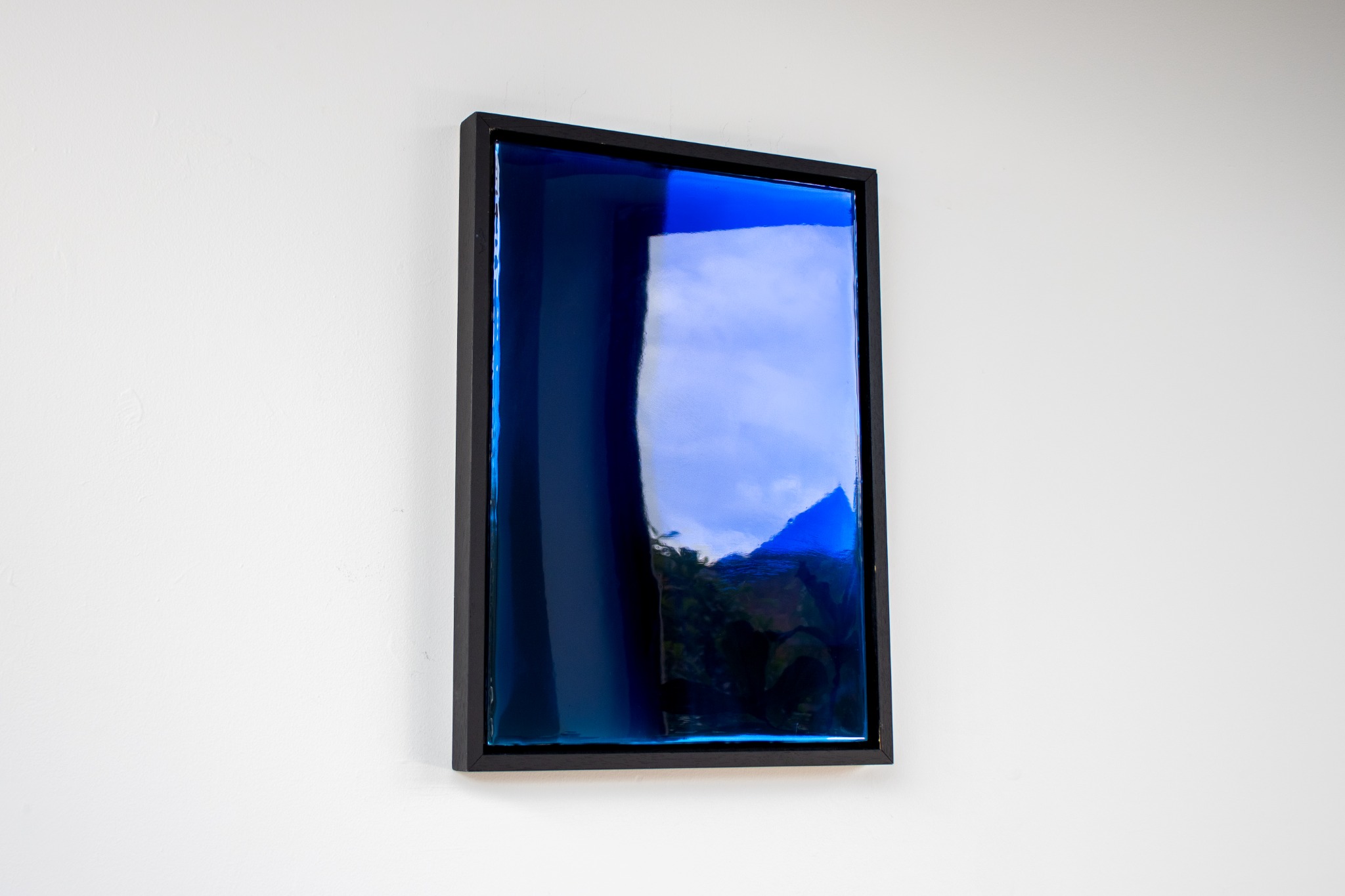
This is the part that drew me to blue as a medium. As an artist, having to work for a colour stirs creative curiosity. In my work, I deliberately provoke Blue’s challenging qualities. Layering different hues, reds, greens and purples, beneath a seemingly pure blue surface is how I induce chromatic aberrations. Blue is the one that gives the least. The aberrations are detectable in the blue works, but they are far less pronounced than in any other colour. I have no explanation for that. I only know that the wavelength the eye handles worst is also the one my process moves least.
Blue is also what heat looks like at its extreme. A blue flame burns hotter than a yellow one, and the hottest stars in the sky are classified as blue. Yet, we call it a cool colour. I do too, and knowing better has never once changed it. The body’s reading of blue runs against the physics, and the body wins every time.
Rebecca Solnit articulates the game blue plays with us in A Field Guide to Getting Lost. Mountains that appear blue from a distance stop being blue when you arrive among them, and the blue simply moves to the next range beyond. The colour was never in the mountain. It was the distance between you and it. That is also true of my artworks. The depth in a spectral work is not in the resin. It is made in the space where the light crosses on its way back. This is why it changes when you move and why no two people are looking at the same blue.
Artist: Kohlben Vodden · Photograph: Olly Graham
The Meaning
People have always struggled to define what blue actually means. In 1810, Goethe described it as a contradiction between excitement and repose. A century later, Kandinsky called it a feeling of rest. Though he admitted in a footnote that his theory came from spiritual experience rather than scientific proof.
The evidence of a conflicting meaning really stacks up in a 2025 review of 128 years of research, covering 42,266 participants across 64 countries. This research found blue described as calming in just under half the studies that examined it, and linked to sadness in more than half. It is both, in almost equal measure, and the two cannot be separated.
Almost everything else you have been told about the psychology of blue is wrong. Given a task requiring careful, systematic attention and asked to choose the background colour that would help, people chose wrong. Blue improved creative performance and red improved accuracy, and the participants could not report which was which while it was happening.
This is where things get interesting. Contemporary wisdom proves that what blue means is learned, culturally variable, and largely made up. What blue does to the body is not. A pupil closes in a blind eye. Melatonin drops. A reaction time shifts because of a word nobody is thinking, as I will come to. Those responses do not require you to have been told anything, and they do not care what you believe about the colour.
The strongest case against me comes from the person who knows blue best. Michel Pastoureau, whose history of the colour is the standard work. Colour, he writes, is first and foremost a social phenomenon. On that reading, blue means whatever a given society has decided it means, and nothing more.
On meanings, he is right and I agree with him. However, on response, he is describing something else. A pupil closing in an eye with no rods or cones is not a social phenomenon, and neither is a body clock shifting in a person who cannot see. The history of blue is social. The power of it is not.
So the meanings were assigned. The response was already there. I spent most of my life mistaking the first for the second, which is the same error the whole subject makes.
Artist: Kohlben Vodden · Photograph: Olly Graham
The Pigment
For most of human history, blue had to be manufactured, and the best of the natural kind made us really work for it. Ultramarine was ground from lapis lazuli, dug out of one remote region of Afghanistan and moved across a continent to reach a painter’s studio. It was saved for where it would be seen to matter: the Virgin’s robe, the cloak of an archangel.
My own materials run the other way. The work is made of light interactions rather than of substance. The more material there is in the mix, the less the light can dance. So I favour dyes over pigmented inks, since a dye dissolves into the medium while a pigment hangs in it as particles that scatter what passes through. The Renaissance measured a blue by what the pigment cost. I measure one by how little stands in the light’s way.
Kandinsky shared my philosophy back in 1911. In Concerning the Spiritual in Art, he argued that blue acts on the psyche, pulling the viewer into a state of rest. He was the theoretical ancestor of the colour field painters, describing (from observation only) the phenomenon I am now documenting.
That is part of why the colour field movement found blue so compelling. For Rothko, Frankenthaler and Barnett Newman, colour carried the whole weight of the work. It was not describing something else. Blue, with all its historical weight and perceptual difficulty, was the most serious colour available. It carried everything that colour field painting was attempting to do: to create a direct, unmediated encounter between viewer and colour, bypassing representation entirely.
I did not know I was working in that tradition when I developed my spectral painting process. I found the lineage afterwards, which is becoming a habit. What I do with it is not inherited. The colour field painters put colour on a plane and asked you to stand in front of it. I use resin and dye over a reflective surface, so the colour is not on the plane at all. It is made in the light coming back. You see your own reflection inside the field, with the aberration vibrating around it. That is a very different experience compared to looking at a painting.
Artist: Kohlben Vodden · Photograph: Olly Graham
The Word
Blue was the last of the primary colours to be named, in almost every language across human history. It is well documented that languages develop colour words in a consistent order: black and white first, then red, then green and yellow, and only then blue. This pattern was identified by Brent Berlin and Paul Kay in 1969, across 98 languages chosen to reduce the chance of borrowed colour terms. That spread is what makes it remarkable.
Looking further back, nearly three thousand years ago a Greek poet called Homer composed the two epics that became the foundation of Western literature. The Iliad and the Odyssey run to tens of thousands of lines, describing battle, weather, the sea and the sky with extraordinary precision. He looked at the sky and called it bronze. He looked at the sea and called it the colour of wine. It’s interesting to note that the word he reached for when he looked up was the name of a metal, when no other word was available to him. Blue does not appear anywhere in his descriptions of the natural world, a gap first noticed in 1858 by William Gladstone, the Homeric scholar. Whatever Homer saw when he looked at the sky, he had nothing to call it, and reached instead for something hard and warm and made.
I run into the shortage constantly. English gives me one word for a range I work in every day, so I end up adding descriptors. The blue-green in Authenticity I describe as petrol. That is not a colour word. It is a substance, chosen because no available colour word gets close, which puts me in the same position as Homer reaching for bronze. Turkish made the same move and kept it. Its word for dark blue, lacivert, comes from the Persian name for lapis lazuli itself, so the stone from that Afghan valley is still sitting inside the word.
My own process, however, runs the other way. The concept comes first, then the name, then the colour that represents it. Authenticity was a word before it was a blue. But that is only true of the making. Whoever stands in front of the finished work gets it in the order everyone else does, colour response first and name afterwards.
Curiously, Russian has no single word for blue. It has two: goluboy and siniy (light and dark). A Russian speaker cannot say ‘blue’ without choosing one. Turkish divides it too, between mavi and lacivert (blue and dark blue), though whether that second word has hardened into a colour term of its own is still argued over. That linguistic habit also reaches into the eye. In experiments, people are shown a target square with two options beneath it and asked to pick the match. Russian speakers are faster when the two options belong to different linguistic categories, one goluboy and one siniy, than when both options are variations of the same word. Their language creates a boundary, and crossing that boundary makes the visual task easier. An English speaker, trapped with only one word for all of it, gains no such advantage.
To confirm that language was the cause, researchers had participants memorise a string of numbers while they performed the matching task. This distracted the brain’s language centre, and the advantage disappeared. However, when they performed a non-verbal task instead, the advantage remained. This suggests language isn’t just labelling colours after the fact; it’s actively shaping our vision the moment we look. These findings, published in 2007 by researchers at MIT and Stanford, confirm that language shapes our experience of colour.
This does not contradict the idea that colour arrives before we can name it. It clarifies it. Naming is not a conscious choice we make at the start. By the time a word comes to mind, the eyes and the brain have already finished their work without waiting for our permission. Language does not create the experience. It simply sharpens what the body is already seeing.
The language holds the contradiction in plain sight. Blue is what we feel when we are low, and it is also what arrives from nowhere. Once in a blue moon. Out of the blue.
That gap between perceiving something and being able to name it is precisely the territory I work in as an abstract artist. Colour field painting exists in that gap. My spectral paintings exist in that gap. Blue is where the gap is widest.
Artist: Kohlben Vodden · Photograph: Olly Graham
The Note
Blue got into music too. In blues playing, a blue note is a pitch sung or bent slightly below where the Western scale says it belongs, a quarter tone or so flat. It falls between the piano keys, which is why theory has never been able to account for it properly. The pitch is widely thought to have come into American music through West African vocal inflection, carried across the Atlantic by enslaved people and kept alive in singing long before it was played on any instrument.
So there is a sound called blue that lives in the gap between the notes we have names for. It arrived from another continent, through another sense, in the hands of people with no interest in pigment at all. And yet, it says the same thing.
I cannot hear it the way a musician can. What I can see is that when a thing has no place in the system, people build the thing anyway and let the system catch up.
Artist: Kohlben Vodden · Photograph: Olly Graham
The Field
Few colours have been written about more. Gass, Nelson, Solnit, Jarman, Mavor, all of them circling it, and every one of them chose it. Nelson begins by supposing she had fallen in love with a colour. Jarman was losing his sight to AIDS, and made a film that is nothing but a blue screen and voices. However, blue was given to me as a child and handed to me again as a subject when I was an adult. I could only truly see blue when I understood that our perception of things and people are flawed.
Blue arrives before you can account for it, so I build for an encounter rather than for a reading. Where Rothko, Frankenthaler and Newman worked within the flat plane, I work outward: layers of pigmented resin over a reflective surface, a process developed to give the light physical distance to travel. The result is not observed colour; it is colour that exists only in the exchange between the work, the room it is in, and the person standing before it.
Two recent artworks operate in this space.
Secrets is rendered in a deep, near-black blue that sits at the very edge of visibility. It reminds me of the blue paintings of Ad Reinhardt, who in the 1950s pushed blue deliberately towards darkness, taking them to the edge of black. Only through sustained looking did the subtle variations of tone and structure reveal themselves. Visual meaning that withheld itself until it was earned. Secrets operates in that tradition. It is a blue that conceals as much as it reveals, that holds the duality of secrecy. It is the blue that shows us that what can protect us, can also confine us, and what is hidden shapes us as much as what is seen.
Authenticity moves into petrol-teal: a blue-green that escapes standard colour vocabulary. It is a space where the temperature shifts. Not the near-black blue of concealment, but a colour where the retreating depth of blue is caught by the emerging warmth of green, whatever the physics says about either. Authenticity is not a declaration. It is the absence of resistance between pure blue and pure green. The freedom that remains when there is nothing left to perform.
In each piece, the reflective surface draws the viewer into the work. They do not observe the blue from a distance. They enter it. What they experience cannot be passively received. It earns its meaning through the specific encounter between work, viewer, and environment. It reaches them before they can account for it.
This is why blue matters to me. Not because it is beautiful, though it often is. But because it demands something. Because it doesn’t care what you believe. No colour has made the eye, history and language work harder to possess it. And yet something in us responded to blue long before we could focus on it, produce it or name it, and everything since has been an attempt to catch up. The eye, the pigment, the word, the meaning, the note. Each one an instrument built after the fact. My surfaces are the latest of them, and they will be no more complete than the rest.
Artist: Kohlben Vodden · Photograph: Olly Graham
Artist: Kohlben Vodden · Photograph: Olly Graham
Related Reading

A Topography of Silence
On light, the surface of stone and our habits of seeing, through Ali Ilgazlı’s black-and-white photographs.
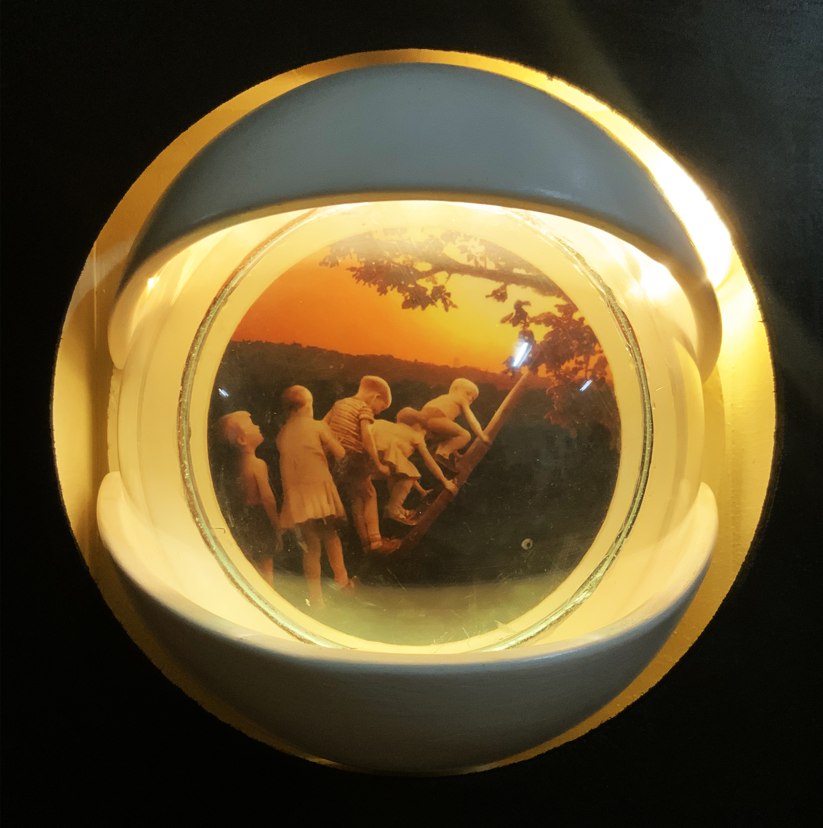
Seda Boy — Sun: About the Work
An artist’s account of how a found photograph is transformed through a lens, material and light.